
MATCHY-MATCHY
- Jul 18, 2023
- 1 min read
I’m not a huge fan of everything matching perfectly, the more eclectic the better! But when it comes to drapes (or curtains as some may call them), I‘m obsessed with the tone-on-tone or pattern-on-pattern aesthetic. This is where the drapes match the wall color closely or exactly, or if you are more daring, the pattern in the drapes matches the wallpaper pattern.

Sure, drapes are a great opportunity to add more color, texture, pattern or visual interest to a room, but for a chic, modern look, try adding drapes in the same color or pattern as the surrounding walls.
It shows that you have confidence in your design style and says to others “I could use contrasting drapes, but everything else in here is so fabulous that I don’t need to!”
It also says that you really thought about the overall design of your room and the drapes don’t look like an afterthought.
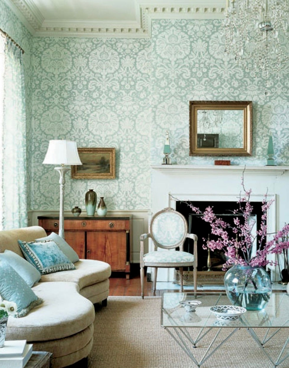
TONE-ON-TONE


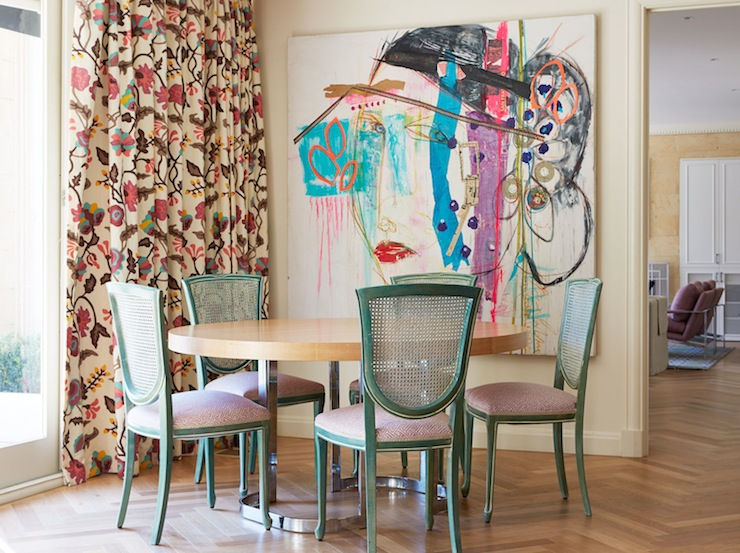
PATTERN-ON-PATTERN
The wallpaper matching the drapes relates very closely to my last post The Golden Days. This was used throughout The Golden Girls home, which may be where my obsession began. If there is any style your grandmother would approve of, this is probably it!
As long as the rest of your room isn’t too busy or fussy, matching these two elements can add rich dimension without the visual clutter that sometimes comes with contrasting drapes.


Try it and create a more harmonious drape-to-room relationship!


Comments